Note
Go to the end to download the full example code.
Improve your data science workflow with skops
Introduction
The goal of this exercise is to go through a semi-realistic data science and machine learning task and develop a practical solution for it. We will learn about the following topics:
Perform exploratory data analysis
Do some non-trivial feature engineering
Explain how the feature engineering informs the choice of machine learning model and vice versa
Show how to make use of a couple of advanced scikit-learn features and explain why we use them - Create a model card that provides useful information about the model
Share the model by uploading it to the Hugging Face Hub
Imports
Before we start, we need to import a couple of packages. In particular, to run this code, we need to have the following 3rd party packages: jupyter, matplotlib, pandas, scikit-learn, skops.
So if you want to run this exercise yourself and these packages are not installed yet in your Python environment, you should run:
python -m pip install jupyter matplotlib pandas scikit-learn skops
from operator import itemgetter
from pathlib import Path
from tempfile import mkdtemp

import matplotlib.pyplot as plt
import numpy as np
import pandas as pd
from matplotlib.patches import Rectangle
from sklearn.compose import ColumnTransformer
from sklearn.datasets import fetch_california_housing
from sklearn.dummy import DummyRegressor
from sklearn.ensemble import (
    GradientBoostingRegressor,
    RandomForestRegressor,
    StackingRegressor,
)
from sklearn.inspection import DecisionBoundaryDisplay, permutation_importance
from sklearn.linear_model import LinearRegression
from sklearn.metrics import get_scorer
from sklearn.model_selection import GridSearchCV, cross_val_predict, train_test_split
from sklearn.neighbors import KNeighborsRegressor
from sklearn.pipeline import Pipeline
from sklearn.preprocessing import FunctionTransformer
from sklearn.tree import DecisionTreeRegressor

from skops import card
from skops import io as sio
plt.style.use("seaborn-v0_8")
Analyzing the dataset
Fetch the data
First of all, let’s load our dataset. For this exercise, we use the California Housing dataset. It can be downloaded using the function from scikit-learn. If called the first time, this function will download the dataset, on subsequent calls, it will load the cached version.
We will make use of the option to set , which will return the data as a pandas. This will make our much easier than working with a numpy array, which it would return otherwise.
data = fetch_california_housing(as_frame=True)
The dataset comes with a description. If not already familiar with the dataset, it’s always a good idea to read the included description.
print(data.DESCR)
.. _california_housing_dataset:

California Housing dataset
--------------------------

**Data Set Characteristics:**

:Number of Instances: 20640

:Number of Attributes: 8 numeric, predictive attributes and the target

:Attribute Information:
    - MedInc        median income in block group
    - HouseAge      median house age in block group
    - AveRooms      average number of rooms per household
    - AveBedrms     average number of bedrooms per household
    - Population    block group population
    - AveOccup      average number of household members
    - Latitude      block group latitude
    - Longitude     block group longitude

:Missing Attribute Values: None

This dataset was obtained from the StatLib repository.
https://www.dcc.fc.up.pt/~ltorgo/Regression/cal_housing.html

The target variable is the median house value for California districts,
expressed in hundreds of thousands of dollars ($100,000).

This dataset was derived from the 1990 U.S. census, using one row per census
block group. A block group is the smallest geographical unit for which the U.S.
Census Bureau publishes sample data (a block group typically has a population
of 600 to 3,000 people).

A household is a group of people residing within a home. Since the average
number of rooms and bedrooms in this dataset are provided per household, these
columns may take surprisingly large values for block groups with few households
and many empty houses, such as vacation resorts.

It can be downloaded/loaded using the
:func:`sklearn.datasets.fetch_california_housing` function.

.. rubric:: References

- Pace, R. Kelley and Ronald Barry, Sparse Spatial Autoregressions,
  Statistics and Probability Letters, 33:291-297, 1997.
Exploratory data analysis
Now it’s time to start exploring the dataset. First of all, let’s determine what the target for this task is:
target_col = data.target_names[0]
print(target_col)
MedHouseVal
The target column is called “MedHouseVal” and from the description, we know it designates “the median house value for California districts, expressed in hundreds of thousands of dollars”.
Next let’s extract the actual data, which, as mentioned, is contained in
a pandas DataFrame:
For now, we leave the target variable inside the DataFrame, as
this will facilitate the upcoming analysis. Once we get to modeling, we
should of course separate the target data to avoid accidentally training
on the target.
Let’s peak at some properties of the data.
(20640, 9)
df.head()
Scaling the target
Before we continue working with the data, let’s do a small adjustment. From the description, we know that the target variable, the median house price, is expressed in units of $100,000. For our first row, that means the actual price is $52,600, not $52.6 (which would be very cheap, even for 1990).
In theory, the unit should not matter for our work, but let’s still convert it to $. This is because when we search for general solutions to this task, most people work with $ values. If we use a different unit here, it makes comparison to these results unnecessarily difficult.
Differences to other versions of the dataset
Another notable difference in this particular dataset is that some columns are already averages. E.g. we find the column AveRooms, which is the average number of rooms per household of this group of houses. In other versions of the dataset (like the one on kaggle), we will, however, find the total number of rooms and the number of households. So here, some feature engineering was already performed by calculating the averages. This is fine and we can keep it like this.
Missing values
Furthermore, in the description, we find: Missing Attribute Values: None. This probably means that there are no missing values, but let’s check ourselves just to be certain:
df.isna().any()
MedInc         False
HouseAge       False
AveRooms       False
AveBedrms      False
Population     False
AveOccup       False
Latitude       False
Longitude      False
MedHouseVal    False
dtype: bool
Indeed, the dataset contains no missing values. If it did, we could have made use of the imputation features of sklearn.
Distributions of variables
It’s always useful to take a look at the distributions of our variables. This is best achieved by visual inspection, which is why we will create a couple of plots. For this exercise, we use matplotlib for plotting, since it’s very powerful and popular. It also works well with pandas.
First we want to focus on the following columns:
cols = ["MedInc", "HouseAge", "AveRooms", "AveBedrms", "Population", "AveOccup"]
These are all our feature variables except for the geospatial features, “Longitude” and “Latitude”. We will analyze those more closely later.
The most basic plot we can create for analyzing the distribution is the histogram. So let’s plot the histograms for each of those variables.
Before we take a closer look at the data, just a few words on how we
create the plots. Since we have 6 variables, it would be convenient to
plot the data in a 3x2 grid. That’s why createa matplotlib figure with 6
subplots, using 3 rows and 2 columns. The resulting axes
variable is a 3x2 numpy array that contains the individual subplots.
We also want to make use of the pandas plotting method, which we can
call using df.plot. This uses matplotlib under the hood, so
it’s not strictly needed. But the nice thing is that pandas provides
some extra convenience, e.g. by automatically labeling the axes.
In order for pandas to plot onto our created figure with its subplots, we pass
the X argument to df.plot. This tells pandas to plot onto this
subplot, instead of creating a new plot. Another little trick is to
flatten the subplot array while looping over it. That way, we don’t need
to take care of looping over its two dimensions separately.
Finally, we should also call plt.tight_layout() to prevent the subplots
from overlapping.
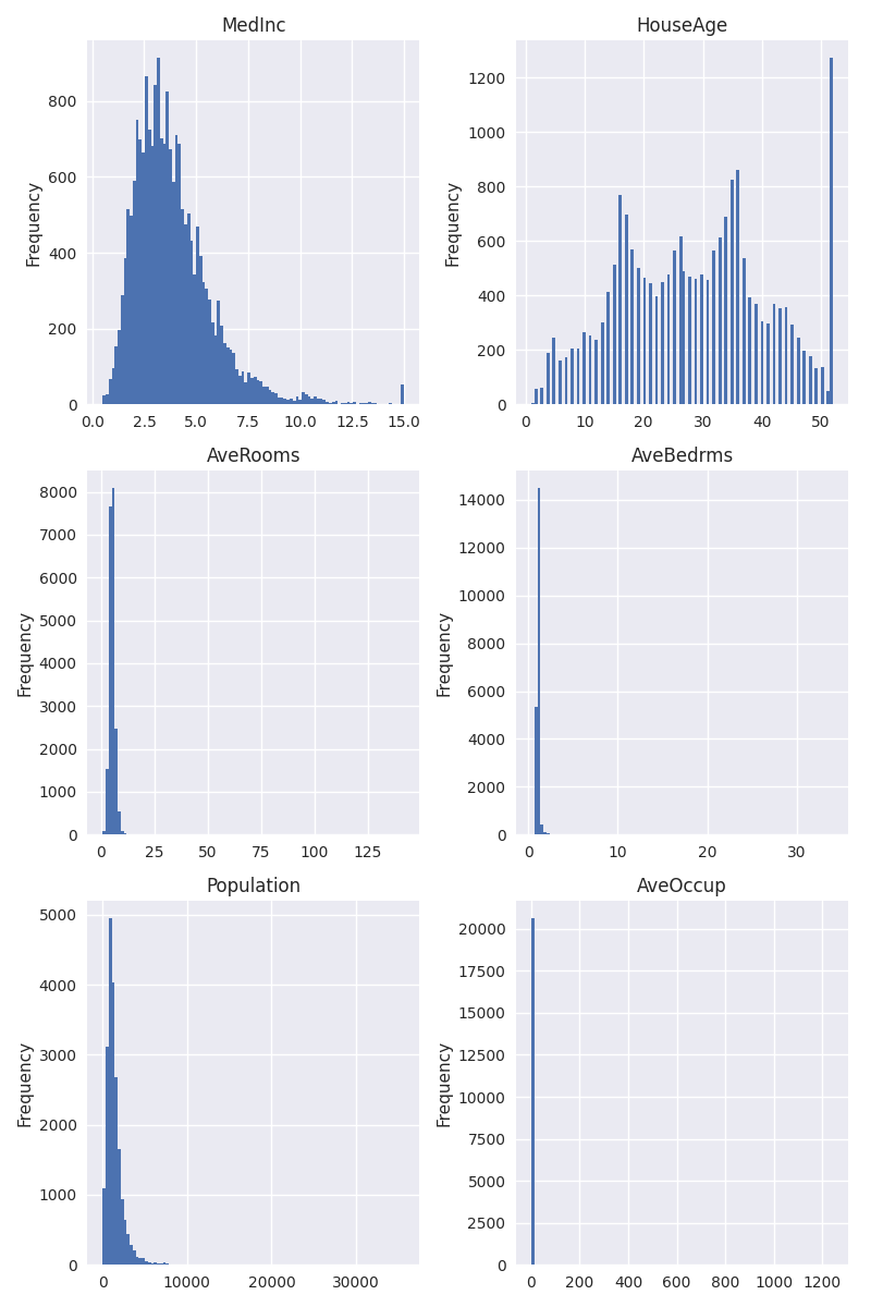
Already, we can make some interesting observations about the data. For “MedInc”, but especially for “HouseAge”, we see a large bin to the right side of the distribution. This could be an indicator that values might have been clipped. Let’s look at “HouseAge” more closely:
df["HouseAge"].describe()
count    20640.000000
mean        28.639486
std         12.585558
min          1.000000
25%         18.000000
50%         29.000000
75%         37.000000
max         52.000000
Name: HouseAge, dtype: float64
df["HouseAge"].value_counts().head().to_frame("count")
So we see that there are 1273 samples with a house age of 52, which also happens to be the maximum value. Could this be coincidence? Perhaps, but it’s unlikely. The more likely explanation is that houses that were older than 52 years were just clipped at 52. In the context of the problem we’re trying to solve, this doesn’t make a big difference, so we will just accept this peculiarity.
Next we can see in the histograms above that for “AveRooms”, “AveBedrms”, “Population”, and “AveOccup”, the bins are squished to the left. This means that there is a fat right tail in the distribution, which might be problematic. When looking at the description, we find a potential explanation:
An household is a group of people residing within a home. Since the average number of rooms and bedrooms in this dataset are provided per household, these columns may take surpinsingly large values for block groups with few households and many empty houses, such as vacation resorts.
So what should we do about this? For the purpose of plotting the values, we should certainly think about removing these extreme values. For the machine learning model we will train later, the answer is: it depends. When we use a model like linear regressions or a neural network, these extreme values can be problematic and it would make sense to scale the values to have a more uniform or normal distribution. When using decision tree-based models, these exteme values are not problematic though. A decision tree will split the data into those samples that are less than or greater than a certain value – it doesn’t matter how much smaller or greater the values are. Since we will actually rely on tree-based models, let’s leave the data as is (except for plotting).
When it comes to plotting, how can we deal with these extreme values? We
could scale the data, e.g. by taking a log. This can be
achieved by passing logx=True to the plotting method. However,
the log scale makes it harder to read the actual values of the data.
Instead, let’s use a more brute force approach of simply excluding that
1% largest values. For this, we calculate the 99th percentile of the
values and exclude all values that exceed that percentile. Apart from
that change, the plots are the same as above:
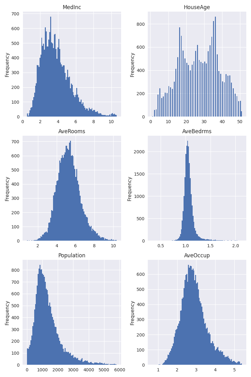
With extremely large values excluded, we can see that the variables are distributed in a very reasonable fashion. With a bit of squinting, the distributions almost look Gaussian, which is what we like to see.
Correlations with the target
Now it’s time to look at how our features are correlated with our target. After all, we plan on predicting the target based on the features, and even though correlation with a target is not necessary for a feature to be helpful, it’s a strong indicator. As before, we will filter out extreme values.
fig, axes = plt.subplots(3, 2, figsize=(8, 12))
for ax, col in zip(axes.flatten(), cols):
    quantile = df[col].quantile(0.99)
    df_subset = df[df[col] < quantile]
    correlation = df_subset[[col, target_col]].corr().iloc[0, 1]
    title = f"Pearson correlation coefficient: {correlation:.3f}"
    df_subset.plot(
        kind="scatter", x=col, y=target_col, s=1.5, alpha=0.05, ax=ax, title=title
    )
plt.tight_layout()
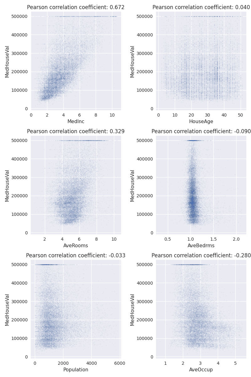
Again, let’s try to improve our understanding of the dataset by visually inspecting the outcomes. The first thing to notice is perhaps that our target, the “MedHouseVal”, seems to be clipped at $500,000. Let’s remember that and return to it later.
Next we should notice that apart from “MedInc”, none of the variables seem to strongly correlate with the target. If this were a real business problem to solve at a company, now would be a good time to get ahold of a domain expert and verify that this is expected.
We also calculate the Pearson correlation coefficient and show it in the plot titles, but honestly, it cannot tell us much we can’t already determine by visual inspection.
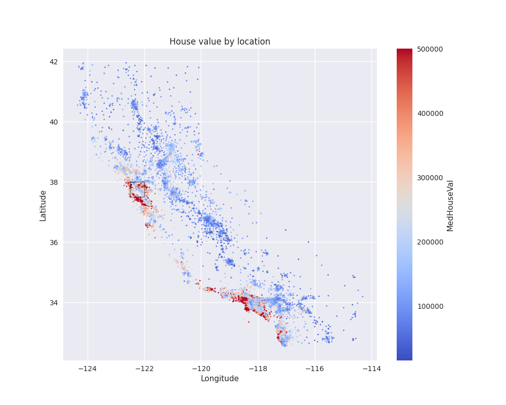
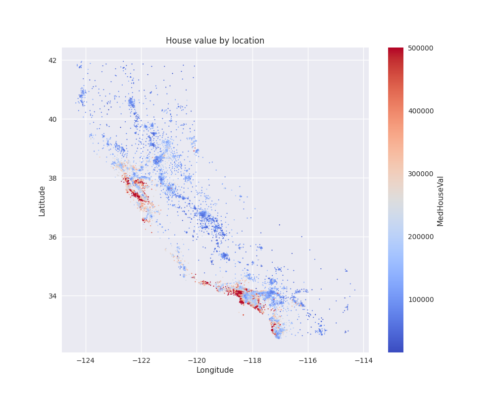
Geospatial features
Now it’s time to take a look at the geospatial data, namely “Longitude” and “Latitude”. We already know that our dataset is limited to the US state of California, so we should expect the data to be exclusively in that area.
Before actually plotting the data, let’s take a quick brake and form a hypothesis. We can reasonably expect that housing prices should be high in metropolitan areas. For California, this could be around Los Angeles and the bay area. Does our data reflect that?
To answer this question, we can plot the target variable as a function of its coordinates. Since we deal with longitude and latitude, and since it’s reasonably likely that the Earth is not flat, it is not quite correct to just plot the data as is. It would be more accurate to use a projection to map the coordinates to 2 dimensions, e.g. by using geopandas.
For our purposes, however, despite the size of California, we should be able to get away without using any projections. So let’s simplify our life by just using raw longitude and latitude.
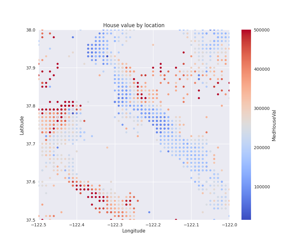
fig, ax = plt.subplots(figsize=(10, 8))
df.plot(
    kind="scatter",
    x="Longitude",
    y="Latitude",
    c=target_col,
    title="House value by location",
    cmap="coolwarm",
    s=2.5,
    ax=ax,
)
inset = (-122.5, 37.5)
rect = Rectangle(
    inset, 0.5, 0.5, linewidth=1, edgecolor="k", facecolor="none", alpha=0.5
)
ax.add_patch(rect)
<matplotlib.patches.Rectangle object at 0x76969a881040>
This is an interesting plot. Let’s try to draw some conclusions.
First of all, we see that the locations are not evenly distributed across the state. There are big patches without any data, especially on the eastern side of the state, whereas the western coast is more highly populated. Data is also more sparse in the mountainous area, where we can expect population density to be lower.
Regarding our initial hypothesis about house prices, we can indeed find clusters of high prices exceeding $400,000, whereas the majority of the data points seem to fall below $50,000. After checking on a map, the high priced areas seem to be indeed around Los Angeles and the bay area, but there are other high priced areas as well, e.g. in San Diego.
From this, we can already start thinking about some possibly interesting features. Some variations of this dataset contain, for instance, a variable indicating the closeness to the Ocean, since it seems that areas on the coast are more expensive on average. Another interesting feature could be the distance to key cities like Los Angeles and San Francisco. Here distance should probably be measured in terms of how long it takes to drive there by car, not just purely in terms of spatial distance – after all, most people only have a car and not a helicopter.
As you can imagine, getting this type of data requires additional data sources and probably a lot of extra work. Therefore, we won’t take this route. However, we will develop specific geospatial features below, which will probably capture most of the information we need for this task.
Before advancing further, we should zoom into the geospatial data, given how difficult it is to see details on the plot above. For that, we take a small inset of that figure (marked with a rectangle), which seems to be an interesting spot, and plot it below:
(37.5, 38.0)
What can we take away from this plot? First of all, it shows that even though there are clear patterns of high and low price areas, they can also be situated very close to each other. This could already give us the idea that prices in the neighborhood could be a strong predictor for our target variable, but the size of the neighborhood should not be too large.
Another interesting pattern we see is that the data points are distributed on a regular grid. This is not what we would expect if, say, each point represented a community, town, or city, since those are not evenly spaced. Instead, this indicates that the data was aggregated with a certain spatial resolution. Also, given the gaps, it could be reasonable to assume that data points with too few houses were removed from the dataset, maybe for privacy concerns. Again, talking to a domain expert would help us better understand the reason.
Anyway, we should keep this regular spatial distribution in mind for later.
A final observation about the coordinates. We might believe that for a given longitude and latitude, there is exactly one sample (or 0, if not present). However, there are duplicates when it comes to coordinates, as shown below:
df.duplicated(["Longitude", "Latitude"]).sum()
np.int64(8050)
These rows are not completely duplicated, however, as there are no duplicates when considering all columns:
df.duplicated().sum()
np.int64(0)
At the most extreme end, we find coordinates with 15 samples:
df[["Longitude", "Latitude"]].value_counts().to_frame("count").reset_index().head()
Overall, for more than a third of coordinates, we find more than one data point:
(df[["Longitude", "Latitude"]].value_counts() > 1).mean()
np.float64(0.3457505957108816)
Again, if this were a real business case, we should investigate this further and find someone who can explain this peculiarity in the data. One possible explanation could be that those are samples for the same location but from different points in time. If this were true, we would have to make adjustments, e.g. by considering the time when we make a train/test split. But we have no possibility to verify that time is the explanation. As is, we just accept this fact and keep it in mind for later.
Target variable
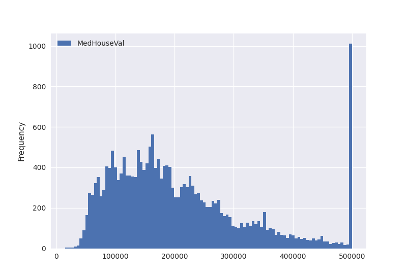
Finally, we should not forget to take a look at the target variable itself. Again, let’s start with plotting its disstribution:
df.plot(kind="hist", y=target_col, bins=100)
<Axes: ylabel='Frequency'>
As we have already established earlier, we find that the target data seems to be clipped. Let’s take a closer look:
df[target_col].value_counts().head()
MedHouseVal
500001.0    965
137500.0    122
162500.0    117
112500.0    103
187500.0     93
Name: count, dtype: int64
Is it possible that this would occur naturally in the data? Sometimes, we may find strange patterns. To give an example, if there was a law that sales above a certain value are taxed differently, we could expect prices to cluster at this value. But this appears to be very unlikely here, especially since prices seem to be rounded to the closest $100, as we can see from the following probe:
(
    (df[target_col] % 100)
    .round()
    .value_counts()
    .to_frame()
    .reset_index()
    .rename(columns={"index": f"{target_col} % $100", target_col: "count"})
)
So if we take the modulo of the house price to $100, we find that it it’s almost always 0 (well, we see a few 100’s, but that’s just a rounding issue). Then we see 965 prices ending in , which are exactly those 965 samples we found with a price of $100,001. Finally, we see 4 prices ending in 9. Let’s take a look:
df[np.isclose(df[target_col] % 100, 99)][target_col].to_frame()
df[target_col].min()
np.float64(14999.000000000002)
So these four samples actually correspond to the lowest prices in the dataset. Therefore, it is very reasonable to assume that the dataset creators decided to set a maximum price of $500,000 and a minimum price of $15,000, with all prices falling outside that range being set to the max/min price +/- . For the prices within the range, they decided to round to $100.
When it comes to our task of predicting the target, this clipping could be dangerous. We cannot know by how much the actual price was clipped, especially when it comes to high prices. For a machine learning model, it could become extraordinarily hard to predict these high prices, because even though the features may, for instance, indicate a price of $1,000,000 for one sample and $500,100 for another, the model is supposed to predict the same price for both. For this reason, let us remove the clipped data from the dataset. Whether that’s a good idea will in reality depend on the use case that we’re trying to solve.
Training a machine learning model
Now that we have gained a good understanding of our data, we move to the next phase, which is training a machine learning model to predict the target.
Remove samples with clipped target data
As a first step, we will remove the samples where the target data has been clipped, as discussed above.
mask = (15_000 <= df[target_col]) & (df[target_col] <= 500_000)
print(
    f"Discarding {(1 - mask).sum()} ({100 * (1 - mask.mean()):.1f}%) of rows because"
    " the target is clipped."
)
Discarding 969 (4.7%) of rows because the target is clipped.
Train/test split
Then we should split our data into a training and a test set. As every data scientist should know, we need to evaluate the data on a different set than we use for training. It would be even better if we created three sets of data, train/valid/test, and only used the test set at the very end. For the training part, we could use cross-validation to get more reliable results, given that our dataset is not that big. For the purpose of this exercise, we make our lifes simple by only using a single train/test split though.
As to the split itself, we just split the data randomly using sklearn’s
train_test_split. There is nothing in the data that would
suggest we need to perform a non-random split but again, this will vary
from use case to use case. Note that we set the random_state
to make the results reproducible.
df_train, df_test = train_test_split(df[mask], random_state=0)
((14753, 9), (4918, 9))
After performing the split, it is now a good time to remove the target
data from the rest of the DataFrame, so that we don’t run the
risk of accidentally training on the target. We use the pop
method for that.
y_train = df_train.pop(target_col).values
y_test = df_test.pop(target_col).values
Feature engineering
Now let’s get to the feature engineering part. Here it’s worth it to think a little bit about what type of ML model we plan to use and how that decision should inform the feature engineering.
In general, we know that for tabular tasks as this one, ensembles of decision trees perform exceptionally well, without the need for a lot of tuning. Examples would be random forest or gradient boosting. We should not try to challenge this conventional wisdom, this class of models is an excellent choice for this task as well. There is, however, a caveat. Let’s explore it more closely.
We know that the geospatial features are crucial for our task, since we saw that there is a very strong relationship between the house price of a given sample and the house price of its neighbors. On the other hand, we saw that all the other variables, safe for “MedInc”, are probably not strong predictors. We thus need to ensure we can make the best use of “Longitude” and “Latitude”.
If we use a tree-based model, can we just input the longitude and latitude as features and be done with it? In theory, this would indeed work. However, let’s remember how decision trees work. According to a certain criterion, they split the data at a certain value. As an example, we could find that the first split of a tree is to split the data into samples with latitude less than 34 and latitude greater than 34, which is roughly the median. Each time we split the data along longitude and latitude, we can imagine the map being devided into four quadrants. So far, so good.
The problem now comes with the patchiness of the data. Looking again at the house value by location plot further above, we can immediately see that we would need a lot of splits to capture the neighborhood relationship we find in the data. How many splits would we need? Let’s take a look.
To study this question, we will take the DecisionTreeRegressor from
sklearn and fit it on the longitude and latitude features. The number of
splits is bounded by the max_depth parameter. So for each level of depth,
the tree splits the data once. That is, for a depth of 10, we get
2**10=1024 splits (in reality, the number could be lower, depending on the
other parameters of the tree).
To get a feeling of what that means in practice, let us first fit 4 decision
trees, using max_depth values of 1, 2, 5, and 10. Then we plot the
decision boundary of the tree after fitting it. We use sklearn’s
DecisionBoundaryDisplay
to plot the data. Here is what we get:
_, axes = plt.subplots(2, 2, figsize=(8, 8))
max_depths = [1, 2, 5, 10]
for max_depth, ax in zip(max_depths, axes.flatten()):
    dt = DecisionTreeRegressor(random_state=0, max_depth=max_depth)
    dt.fit(df_train[["Longitude", "Latitude"]], y_train)
    DecisionBoundaryDisplay.from_estimator(
        dt,
        df_train[["Longitude", "Latitude"]],
        cmap="coolwarm",
        response_method="predict",
        ax=ax,
        xlabel="Longitude",
        ylabel="Latitude",
        grid_resolution=1000,
    )
    ax.set_title(f"Decision boundary for a depth of {max_depth}")
plt.tight_layout()
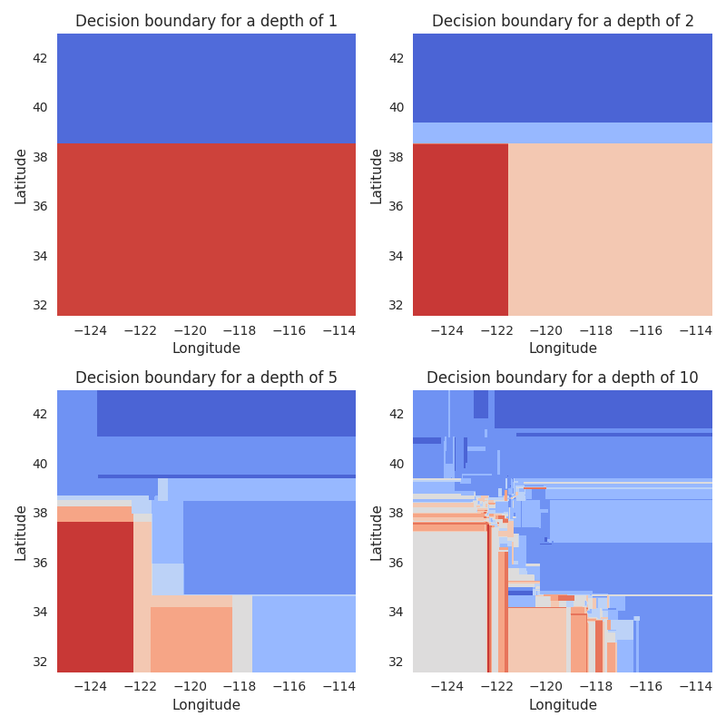
As we have described, with a depth of 1, we split our map in half, with two splits, we get 4 quadrants. This is shown in the first row.
In the second row, we see the outcomes for depths of 5 and 10. Especially for 10, we see this resulting in quite a few “boxes” that represent neighborhoods with similar prices. But even with this relatively high number of splits, the “resolution” of the resulting map is quite bad, lumping together many areas with quite different prices.
So what can we do about that? The easiest solution would be to increase
the max_depth parameter to such a high value that we can
actually model the spatial relationship well enough. But this has some
disadvantages. First of all, a high max_depth parameter can
result in overfitting on the training data. Remember that we also have
other variables that we want to include, the tree will also split on
those. Second of all, a high max_depth makes the model bigger
and slower. Depending on the application, this could be a problem for
productionizing the model.
Another solution is that we could use an ensemble of decision trees. The result of that will be multiple maps as those above layered on top of each other. Although this will certainly help, it’s still not a perfect solution, since it would still require quite a lot of trees to achieve a good resolution. Imagine a dataset with much more samples and much more fine-grained data, we would need a giant ensemble to fit it.
At the end of the day, we have to admit that decision tree-based models
are just not the best fit when it comes to modeling geospatial
relationships. Can we think of a model that is better able to model this
type of data? Why, of course we can. The k-nearest neighbor (KNN) family
of models should be a perfect fit for this, since we want to model
neighborhood relationships. To see this in action, let’s again plot
the decision boundaries, this time using the
KNeighborsRegressor from sklearn:
this controls the level of parallelism, feel free to set to a higher number
N_JOBS = 1
_, ax = plt.subplots(figsize=(5, 5))
knn = KNeighborsRegressor(n_jobs=N_JOBS)
knn.fit(df_train[["Longitude", "Latitude"]], y_train)
DecisionBoundaryDisplay.from_estimator(
    knn,
    df_train[["Longitude", "Latitude"]],
    cmap="coolwarm",
    response_method="predict",
    ax=ax,
    xlabel="Longitude",
    ylabel="Latitude",
    grid_resolution=1000,
)
ax.set_title("Decision boundary of KNN")
Text(0.5, 1.0, 'Decision boundary of KNN')
Now if we compare this to the decision boundaries of the decision trees, even
with a depth of 10, it’s a completely different picture. The KNN model, by its
very nature, can easily model very fine grained spatial differences. The
granularity will depend on the k part of the name, which indicates the
number of neighbors that are used to make the prediction. At the one extreme,
for k=1, we would only consider a single data point, resulting in a very
spotty map. At the other extreme, when k is the size of the total dataset,
we would simply average across all data points. Choosing a good value for
k is thus important.
We will now go into more details of the KNN model. If you’re wondering how this is related to feature engineering, it will become clear later, as will actually use the KNN model for the purpose of creating a new feature. So please be patient.
Aside: distance metrics
Before we explore this problem further, let’s talk about distance
metrics. For a KNN model to work, we need to define the distance metric
it uses to determine the closest neighbors. By default,
KNeighborsRegressor uses the Euclidean distance.
Earlier, we saw that our data points are distributed on a regular grid. This means, if we take a specific sample, and if we assume that it’s neighboring spots are not empty, there should be 4 neighbors at exactly the same distance, namely the neighbors directly north, east, south, and west. Similarly, neighbors 5 to 8, in the directions NE, SE, SW, and NW, should also have the exact same distances.
Let’s check if this is true. For this, we fit a KNN and then use the
kneighbors method to return the closest neighbors.
knn = KNeighborsRegressor(20)
knn.fit(df[["Longitude", "Latitude"]], df[target_col])
distances = knn.kneighbors(
    df[["Longitude", "Latitude"]].iloc[[123]], return_distance=True
)[0].round(5)
print(distances)
[[0.      0.01    0.01    0.01    0.01    0.01    0.01    0.01    0.01
  0.01    0.01    0.01    0.01    0.01414 0.01414 0.01414 0.01414 0.01414
  0.01414 0.01414]]
So we find indeed that the distances are discrete, with many samples having exactly the same distance like 0.01. The closest neighbor has a distance of 0 – this is not surprising, as this the sample itself. However, unlike what we expected, we don’t find exactly four equally distant closest neighbors. Instead, for this sample we find 12 samples with a distance of exaclty 0.01 (i.e. exactly one step to the north, east, south, or west). How come?
Remember from earlier that we found duplicate coordinates in our data? This is most likely such a case. So let’s remove duplicates and determine the distances again:
knn = KNeighborsRegressor(20)
df_no_dup = df.drop_duplicates(["Longitude", "Latitude"]).copy()
knn.fit(df_no_dup[["Longitude", "Latitude"]], df_no_dup[target_col])
distances = knn.kneighbors(
    df[["Longitude", "Latitude"]].iloc[[123]], return_distance=True
)[0].round(5)
print(distances)
[[0.      0.01    0.01    0.01    0.01    0.01414 0.01414 0.01414 0.01414
  0.02    0.02    0.02    0.02    0.02236 0.02236 0.02236 0.02236 0.02236
  0.02236 0.02828]]
This looks much better. Now we find exactly 4 neighbors tied for the closest distance, 4 tied for the second closest distance, etc.
The same thing should become even clearer when we change the metric from
Euclidean to Manhattan distance. In this context, the Manhattan distance
basically means how far two points are from each other, if we can only
take steps along the north-south or east-west axis. To calculate this
metric, we can set the p parameter of
KNeighborsRegressor to 1:
knn = KNeighborsRegressor(20, p=1)
knn.fit(df_no_dup[["Longitude", "Latitude"]], df_no_dup[target_col])
distances = knn.kneighbors(
    df[["Longitude", "Latitude"]].iloc[[123]], return_distance=True
)[0].round(5)
print(distances)
[[0.   0.01 0.01 0.01 0.01 0.02 0.02 0.02 0.02 0.02 0.02 0.02 0.02 0.03
  0.03 0.03 0.03 0.03 0.03 0.03]]
Again, we find 4 neighbors with a distance of exactly 0.01, as expected. For distance 0.02, we actually find 8 neighbors. This makes sense, because in Manhattan space, the neighbor north-north of the sample has the same distance as the neighbor north-east, etc., as both require two steps to be reached.
What does this mean for us? There are two important considerations:
When we train a KNN model with a
kthat’s not exactly equal to 4, 8, etc., we run into some problems. If we take, for instance,k=3, and the 4 closest neighbors are equally close,KNeighborsRegressorwill actually pick an arbitrary set of 3 from those 4 possible candidates. This generally something we want to avoid in our ML models. In practice, however, the problem isn’t so bad, because we have duplicates and because some neighbor spots are empty, as we saw earlier. This makes it less likely that many data points exhibit different behavior for a very specifick.The second consideration is that we should figure out which metric is best for our use case, Euclidean or Manhattan. If people were traveling by air, Euclidean makes most sense. If they traveled on a rectangular grid (like the streets in Manhattan, hence the name), Manhattan makes more sense. In practice, we have neither of those. So let’s just use what works better!
Determining the best hyper-parameters for the KNN model
With all that in mind, let’s try to find good hyper-parameters for our
KNN regressor. As mentioned, we should check the value for k
and we should check p=1 and p=2 (i.e. Manhattan and
Euclidean distance). #
On top of those, let’s check one more hyper-parameter, namely
weights. What this means is that when the model finds the
k nearest neighbors, should it simply predict the average
target of those values or should closer neighbors have a higher weight
than more remote neighbors? To use the former approach, we can set
weights=’uniform’, for the latter, we set it to
’distance’.
As for the k parameter, in sklearn, it’s called
n_neighbors. Let’s check the values from 1 to 25, as well as
some higher values, 50, 75, 100, 150, and 200.
Regarding the metrics, we use root mean squared error (RMSE). This could also be replaced with other metrics, it really depends on the use case. Here we choose it because this is the most common one used for this dataset, so if we wanted to compare our results with the results from others, it makes sense to use the same metrics.
(Note: For scoring, we use the ’neg_root_mean_squared_error’,
i.e. the negative RMSE. This is because by convention, sklearn considers
higher values to be better. For RMSE, however, lower values are better.
To circumvent that, we just the negative RMSE.)
To check all the different parameter combinations and to calculate the
RMSE out of fold, we rely on sklearn’s GridSearchCV. We won’t
explain what it does here, since there already are so many tutorials out
there that discuss grid search. Suffice it to say, this is exactly what
we need for our problem.
knn = KNeighborsRegressor()
params = {
    "weights": ["uniform", "distance"],
    "p": [1, 2],
    "n_neighbors": list(range(1, 26)) + [50, 75, 100, 150, 200],
}
search = GridSearchCV(knn, params, scoring="neg_root_mean_squared_error")
search.fit(df_train[["Longitude", "Latitude"]], y_train)
Fortunately, the grid search only takes a few seconds because the model
is quick, the dataset size is small, and we only test 120 different
parameter combinations. If the grid search would take too long, we could
switch to RandomizedSearchCV or HalvingGridSearchCV
from sklearn, or use a Bayesian optimization method from other packages.
Now, let’s put the results of the grid search into a pandas
DataFrame and inspect the top results.
df_cv = pd.DataFrame(search.cv_results_)
df_cv.sort_values("rank_test_score")[
    ["param_n_neighbors", "param_weights", "param_p", "mean_test_score"]
].head(10)
Okay, so there is a clear trend for small k values in the
range of 5 to 9 to fare better. Also ’uniform’ weights seem to
be clearly superior. When it comes to the distance metric, no clear
trend is discernable.
To get a better picture, it is often a good idea to plot the grid search
results, instead of just picking the best result blindly, especially if
the outcome is noisy. For this purpose we will plot four lines, one for
each combination of weights and p, all showing the
RMSE as a function of n_neighbors. Note that we plot
n_neighbors on a log scale, because we want to have higher
resolution for small values.
fig, ax = plt.subplots()
for weight in params["weights"]:  # type: ignore
    for p in params["p"]:  # type: ignore
        query = f"param_weights=='{weight}' & param_p=={p}"
        df_subset = df_cv.query(query)
        df_subset.plot(
            x="param_n_neighbors",
            y="mean_test_score",
            xlabel="Log of the n_neighbors parameter",
            ylabel="negative RMSE",
            label=query,
            ax=ax,
            marker="o",
            ms=5,
            logx=True,
        )
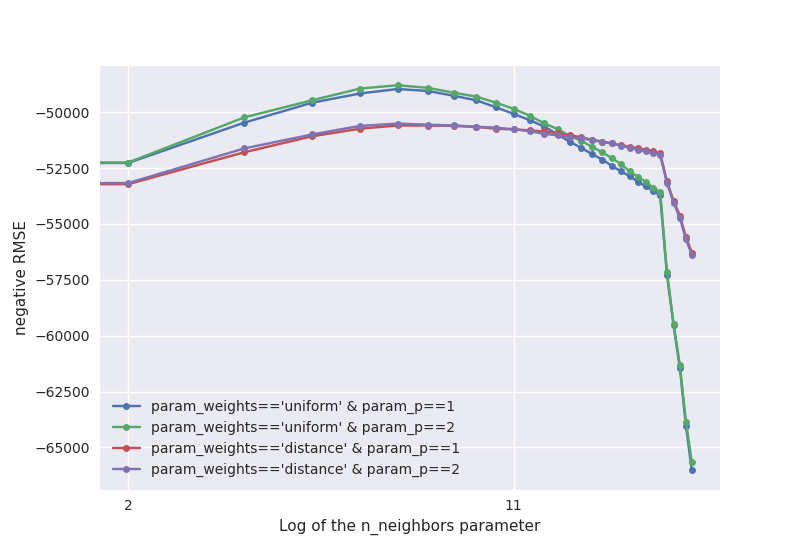
So both for weights==’uniform’ and for
weights==’distance’, we see that p==2 is slightly
better than, or equally good as, p==1. It will thus be safe to
use p==2.
Furthermore, we see that for low values of n_neighbors, it is
better to have weights==’uniform’, while for large values of
n_neighbors, weights==’distance’ is better. This is
perhaps not too surprising: If we consider a lot of neighbors, many of
which are already quite far away, we should give lower weight to those
remote neighbors. When we only look at 5 neighbors, this isn’t necessary
– their distances will be quite similar anway.
Another observation is that the curve for the RMSE as a function of
n_neighbors seems to be quite smooth. This tells us two
things: First of all, the metric isn’t very noisy, at least using the
5-fold cross validation that the grid seach uses by default. This is
good, we don’t want the outcome to be too dependent on randomness.
Moreover, we don’t see any strange jumps at n_neighbors values
like 4 or 8. If you remember the problem we discussed earlier of
arbitrary points being chosen when neighbors have the exact same
distance, this could have been a concern. Since we don’t see it, it’s
probably not as bad as we might have feared.
So now that we have a good idea about what good hyper-parameters for KNN
are, let’s see how the good the predictions from the model are. For
this, we plot the true target as a function of the predictions, which we
calculate out of fold using sklearn’s cross_val_predict.
knn = KNeighborsRegressor(**search.best_params_)
avg_neighbor_val = cross_val_predict(knn, df_train[["Longitude", "Latitude"]], y_train)
fig, ax = plt.subplots(figsize=(5, 5))
ax.scatter(avg_neighbor_val, y_train, alpha=0.05, s=1.5)
ax.set_xlabel(
    f"median house price of {search.best_params_['n_neighbors']} closest neighbors"
)
ax.set_ylabel(target_col)
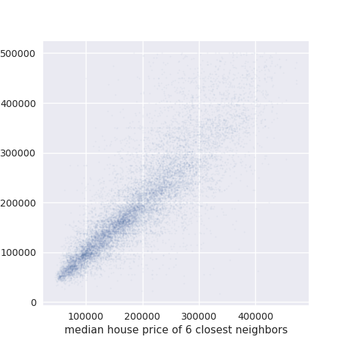
Text(-5.402777777777777, 0.5, 'MedHouseVal')
As we can see, the correlation is quite good between the two. This means that our KNN model can explain a lot of the variability in the target using only the coordinates, none of the other features. In particular, we can easily see that this correlation is much better than the correlation of any of the features that we plotted above. Would it not be nice if we could use the KNN predictions as a feature for a more powerful model?
Why would we want to use the KNN predictions as a feature for another model, instead of just being content with using the KNN as the final predictor? The problem is that with KNN, it is very hard to incorporate the remaining features. Although we can be sure that those features are not as important, they should still contain useful signal to improve the model.
The reason why it is difficult to include arbitrary features like “MedInc” or “HouseAge” into a KNN model is that they are on a completely different scale than the coordinates, so we would need to normalize all the data. Even then, we know that our other features are not very uniformely distributed, which in general is something that the KNN benefits from.
But even if everything was on the same scale and evenly distributed, should we weight a distance of 0.1 in the “MedInc” space the same as a distance of 0.1 in “Longitude” space? Probably not. It just doesn’t make sense to put two completely measurements into the same KNN model.
This is why we will use the KNN predictions as a feature for more appropriate models. This also explains why this is part of the feature engineering section. Doing this correctly is not quite trivial, but below we will see how we can use the tools that sklearn provides to achieve this goal.
Training ML models
Now that we have gained important insights into the data and also formed a plan when it comes to feature engineering, we can start with the training of the predictive models.
Dummy model
As a first step, we start with a dummy model, i.e. a model that isn’t allowed to learn anything from the input data. Often, it’s a good idea to try a dummy model first, as it will give us an idea what the worst score is we should expect. If our proper models cannot beat the dummy model, it most likely means we have done something seriously wrong.
For this dataset, what is the appropriate dummy model? We are trying to
minimize the root mean squared error. This is the same as trying to
minimize the mean squared error (the root is just a monotonic
transformation). And to minimize the mean squared error, if we don’t
know anything about the input data, requires us to predict the mean of
the target. For our convenience, sklearn provides a
DummyRegressor that will do exactly this for us:
Note: Even though we pass df_train, the
DummyRegressor does not make use of it. We could pass an empty
df and the result would be the same.
-get_scorer("neg_root_mean_squared_error")(dummy, df_test, y_test)
100528.43327419003
As a reminder, sklearn only comes with the negative RMSE, so we make it positive again at the end.
Adding KNN predictions as features
Let’s get to the part where we want to add the predictions of the KNN model as features for our final regression model. As we have discussed above, we have some good evidence that the KNN predictions are well suited to capture the spatial relationship between data points, but KNN itself is not good with dealing with the other features, so we want to use a model that can deal with those features on top of the KNN predictions.
Does sklearn offer us a way of adding the predictions of one model as features
for another model? Indeed it does, this is achieved by using the
sklearn.ensemble.StackingRegressor. To quote from the docs:
Stacked generalization consists in stacking the output of individual estimator [sic] and use a regressor to compute the final prediction. Stacking allows to use the strength of each individual estimator by using their output as input of a final estimator.
In our case, that means that we use KNN for the “individual estimator” part and then a different model, like an ensemble of decision trees, for the “final esimator”.
The documentation also states that:
Note that estimators_ are fitted on the full X while final_estimator_ is trained using cross-validated predictions of the base estimators using ``cross_val_predict``.”
This is important to know. It is crucial that the predictions from the
KNNs are calculated using cross_val_predict, i.e out of
fold, otherwise, we run into the risk of overfitting. To understand
this point, let’s take an extreme example. Let’s say we use a KNN with
n_neighbors=1. If the predictions were calculated in fold,
this KNN would completely overfit on the training data and the
prediction would be perfect (okay, not quite, since we have duplicate
coordinates in the data). Then the final model would only rely on the
seemingly perfect KNN predictions, ignoring all other features. This
would be really bad. That’s why the “cross-validated
predictions” part is so crucial.
# Note: We may be tempted to simply add the new feature to the ``DataFrame``
# like this: ``df['pred_knn'] = knn.predict(df[['Longitude', 'Latitude']])``.
However, this is problematic. First of all, we need to make out of fold predictions, as explained above. This code snippet would result in overfitting. We thus need to calculate the out of fold predictions manually, which adds more (errror prone) custom code.
Second, let’s assume we want to deploy the final model. When we call it, we need to pass all the features, i.e. we would need to generate the KNN prediction before passing the features to the model. This requires even more custom code to be added, making the whole application even more error prone. By sticking with the tools sklearn gives us, we avoid the two issues.
By default, StackingRegressor trains the final estimator only
on the predictions of the individual estimators. However, we want it to
be trained on all the other features too. This can be achieved by
setting StackingRegressor(..., passthrough=True), which will
pass through the original input and concatenate it with the
predictions from our KNN.
Another issue we need to solve is that we want the final estimator to be
trained on all features, but the KNN is supposed to be only trained on
longitude and latitude. When we pass all features as X, the
KNN would be trained on all these features, which, as we discussed,
wouldn’t be a good idea. If we only pass longitude and latitude as
X, the final estimator cannot make use of the other features.
What do we do?
The solution here is to pass all the features, but to put the KNN into a
Pipeline with one step selecting only the longitude and
latitude, and the second step being the KNN itself. Unless we’re missing
something, sklearn does not directly provide a transformer that is only
used for selecting columns, but we can cobble one together ourselves.
For this, we choose the FunctionTransformer, which is a
transformer that calls an arbitrary function. The function itself should
simpy select the two columns ["Longitude",
"Latitude"]. This can be done using the
itemgetter function from the builtin operator
library. The resulting Pipeline looks like this:
Pipeline(
    [
        ("select_cols", FunctionTransformer(itemgetter(["Longitude", "Latitude"]))),
        ("knn", KNeighborsRegressor()),
    ]
)
Note: Alternatively, we could have made use of sklearn’s
ColumnTransformer, which does have a builtin way of selecting
columns. It also wants to apply some transformer to these selected
columns, even though we don’t need that. This can be circumvented by
setting this transformer to "passthrough". The end
result is:
Pipeline(
    [
        (
            "select_cols",
            ColumnTransformer(
                [("long_and_lat", "passthrough", ["Longitude", "Latitude"])]
            ),
        ),
        ("knn", KNeighborsRegressor()),
    ]
)
At the end of the day, it doesn’t really matter which variation we use. Let’s go with the 2nd approach.
With this out of the way, what hyper-parameters do we want to use for
our KNN? In our grid search of the KNN regressor, we found that small
values of n_neighbors work best. As to the other
hyper-parameters, we already saw that there is no point in changing the
p parameter from the default value of 2 to 1. For the
weights parameter, we saw that low n_neighbors work
better with uniform, the default, so let’s use that here.
By the way, StackingRegressor can also take multiple
estimators for the initial prediction. Therefore, we could pass a list
of multiple KNNs with different hyper-parameters. This would be a good
idea to test if we want to further improve the models.
Linear regression
Now let’s finally get started with training and evaluating our first ML model
on the whole dataset. As a start, we try out a simple linear regression, which
often provides a good benchmark for regression tasks. Usually, with linear
regressions, we would like to normalize the data first, but sklearn’s
LinearRegression already does this for us, so we don’t need to bother with
that. (Given what we found out about the distributions of some of the features
as shown in the earlier plot with the feature histograms, it would, however,
be worth to spend some time thinking about whether we could improve upon the
default preprocessing.)
The StackingRegressor expects a list of tuples, where the
first element of the tuple is a name and the second element is the
estimator. Plugging our different parts together, we get:
knn_regressor = [
    (
        "knn@5",
        Pipeline(
            [
                (
                    "select_cols",
                    ColumnTransformer(
                        [("long_and_lat", "passthrough", ["Longitude", "Latitude"])]
                    ),
                ),
                ("knn", KNeighborsRegressor()),
            ]
        ),
    ),
]
lin = StackingRegressor(
    estimators=knn_regressor,
    final_estimator=LinearRegression(n_jobs=N_JOBS),
    passthrough=True,
)
-get_scorer("neg_root_mean_squared_error")(lin, df_test, y_test)
44316.269784490505
The final score is already quite an improvement over the results from the dummy model, so we can be happy about that. Moreover, if we compare this score the score we got when we trained a KNN purely on longitude and latitude, it’s also much better, which confirms our decision that using the other features is helpful for the model.
When comparing the results from other people, it also doesn’t look too bad, but we have to keep in mind that the datasets and preprocessing steps are not identical, so differences should be expected.
Just out of curiosity, let’s check the score without using the KNN predictions as features:
lin_raw = LinearRegression(n_jobs=N_JOBS)
-get_scorer("neg_root_mean_squared_error")(lin_raw, df_test, y_test)
66647.75686249179
We see a quite substantial increase in the prediction error. This shouldn’t be too surprising. When the linear regressor tries to fit longitude and latitude, the only thing it can do is try to fit a plane on top of it, which is far too simple to fit the geospatial patterns we observed.
Random forest
Next let’s use our first decision tree-based model, the
RandomForestRegressor. For this, we use the same approach as
above, we only need to swap the final_estimator:
rf = StackingRegressor(
    estimators=knn_regressor,
    final_estimator=RandomForestRegressor(
        n_estimators=100, random_state=0, n_jobs=N_JOBS
    ),
    passthrough=True,
)
-get_scorer("neg_root_mean_squared_error")(rf, df_test, y_test)
42136.85505534634
We can see a nice, but not huge, improvement over using the
LinearRegressor.
Gradient boosted decision trees
Finally, let’s use sklearn’s GradientBoostingRegressor:
gb = StackingRegressor(
    estimators=knn_regressor,
    final_estimator=GradientBoostingRegressor(n_estimators=100, random_state=0),
    passthrough=True,
)
-get_scorer("neg_root_mean_squared_error")(gb, df_test, y_test)
41826.816445595665
The score is almost identical to the RandomForestRegressor, as
is the training time. For other choices of hyper-parameters, this will
certainly differ, but as is, it doesn’t really matter which model we
choose. Here it would be a good exercise to perform a hyper-parameter
search to determine what model is truly better.
Aside: Checking the importance of longitude and latitude as predictive features
Remember that earlier on, we formed the hypothesis that tree-based models would have difficulties making use of the longitude and latitude features because they require a high amount of splits to really be useful? Even if it’s not strictly necessary, let’s take some time to check this hypothesis.
To do this, what we would want to do is to check how much the tree-based model
relies on said features, given that we change the depth of the tree. To
determine the importance of the feature, we will use the
sklearn.inspection.permutation_importance() function from sklearn. Then
we would like to check if longitude and latitude become more important if we
increase the depth of the decision trees.
Be aware that we don’t want to use the StackingRegressor with
the KNN predictions here, because for that model, the longitude and
latitude influence the KNN prediction feature, obfuscating the result.
So let’s use the pure GradientBoostingRegressor here.
Our approach will be to train 3 models with different values for
max_depth. We choose relative small values here because
gradient boosting typically uses very shallow trees (the default depth
is 3). After training, we calculate the permutation importances of each
feature and create a bar plot of the results:
max_depths = [2, 4, 6]
fig, axes = plt.subplots(1, 3, figsize=(12, 8))
for md, ax in zip(max_depths, axes):
    gb = GradientBoostingRegressor(max_depth=md, random_state=0)
    gb.fit(df_train, y_train)
    pi = permutation_importance(gb, df_train, y_train, random_state=0)
    score = -get_scorer("neg_root_mean_squared_error")(gb, df_test, y_test)

    ax.barh(df_train.columns, pi["importances_mean"])
    ax.set_xlim([0, 1.5])
    title = f"permutation importances for max_depths={md}\n(test RMSE: {score:.0f})"
    ax.set_title(title)
    if md > max_depths[0]:
        ax.set_yticklabels([])
plt.tight_layout()
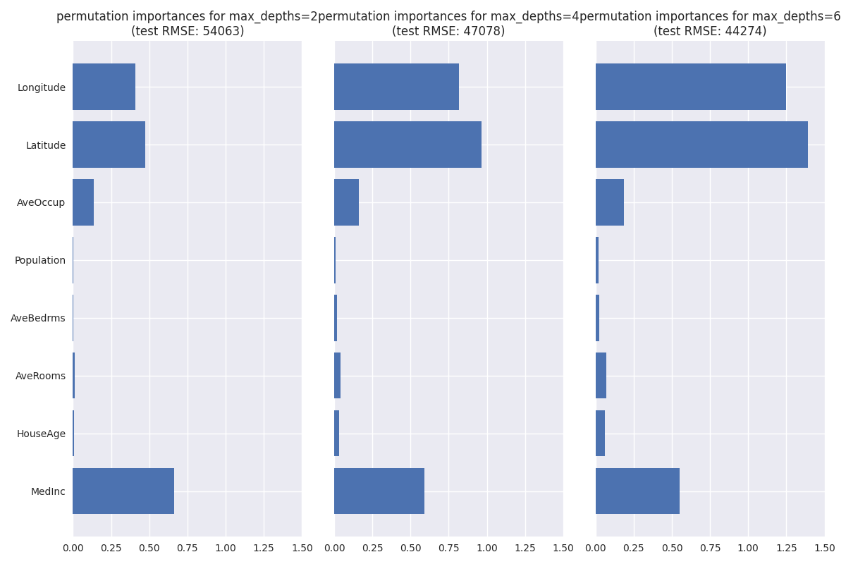
As we can see, longitude and latitude are not very important for
max_depth=2, even being below the importance of
“MedInc”. In contrast, they are more important for
max_depth=4, with the importance growing even more for
max_depth=6. This confirms our hypothesis, though we should be
aware that besides max_depth, other hyper-parameters influence
the effective number of splits we have, so in reality it’s not that
simple.
Out of curiosity, we also show the RMSE on the test set for the individual models. Interestingly, we find that its considerably worse than the scores we got earlier when we included the KNN predictions, not even beating the linear regression! This is a nice validation that our KNN feature really helps a lot.
Final model
Let’s settle on a final model for now. We will use gradient boosting again, only this time using more estimators. In general, with gradient boosting, more trees help more. The tradeoff is mostly that the resulting model will be bigger and slower. We go with 500 trees here (the default is 100), but ideally we should run a hyper-parameter search to get the best results.
gb_final = StackingRegressor(
    estimators=knn_regressor,
    final_estimator=GradientBoostingRegressor(n_estimators=500, random_state=0),
    passthrough=True,
)
-get_scorer("neg_root_mean_squared_error")(gb_final, df_test, y_test)
40709.24898984372
The final RMSE is a bit better than we got earlier when using 100 trees, while the training time is still reasonably fast, so we can be happy with the outcome.
Sharing the model
Saving the model artifact
Now that we trained the final model, we should save it for later usage. We could use pickle (or joblib) to do this, and there’s nothing wrong with that. However, the resulting file is insecure because it can theoretically execute arbitrary code when loading. Thus, if we want to share this models with other people, they might be reluctant to unpickle the file if they don’t trust us completely.
An alternative to the pickle format is the skops format. It is built with security in mind, therefore, other people can open your skops file without worries, even if they don’t trust us. More on the skops format can be found here.
For the purpose of this exercise, let’s use skops by calling
skops.io.dump (skops.io was imported as
sio) and store the model in a temporary directory, as shown
below:
Creating a model card
When we want to share the model with others, it’s good practice to add a model card. That way, interested users can quickly learn what to expect.
As a first approximation, a model card is a text document, often written in markdown, that contains sections talking about what kind of problem we’re dealing with, what kind of model to is used, what the intended purpose is, how to contact the authors, etc. It may also contain some metadata, which is targeted at machines and contains, say, tags that indicate what type of model or task being used. For now, we start without metadata.
To help getting started, we can use the skops.card.Card class.
It comes with a few default sections and provides some convenient
methods for adding figures etc. The
documentation
goes into more details.
For now, let’s start by creating a new model card and adding a few bits
of information. We pass our final model as an argument to the
Card class, which is used to create a table of
hyper-parameters and a diagram of the model.
model_card = card.Card(model=gb_final)
model_card
Card(
  model=StackingRegressor(estimators=[('kn... random_state=0), passthrough=True),
  Model description/Training Procedure/Hyperparameters=TableSection(51x2),
  Model description/Training Procedure/Model Plot=<style>#sk-co...script></body>,
)
Next let’s add some prose the the model card. We add a short description
of the model, the intended use, the data, and the preprocessing steps.
Those are just plain strings, which we add to the card using the
model_card.add method. That method takes **kwargs as
input, where the key corresponds to the name of the section and the
value corresponds to the content, i.e. the aforementioned strings. This
way, we can add multiple new sections with a single method call.
description = """Gradient boosting regressor trained on California Housing dataset

The model is a gradient boosting regressor from sklearn. On top of the standard
features, it contains predictions from a KNN models. These predictions are calculated
out of fold, then added on top of the existing features. These features are really
helpful for decision tree-based models, since those cannot easily learn from geospatial
data."""
intended_uses = "This model is meant for demonstration purposes"
dataset_description = data.DESCR.split("\n", 1)[1].strip()
preproc_description = (
    "Rows where the target was clipped are excluded. Train/test split is random."
)

model_card.add(
    **{
        "Model description": description,
        "Model description/Dataset description": dataset_description,
        "Model description/Intended uses & limitations": intended_uses,
        "Model Card Authors": "Benjamin Bossan",
        "Model Card Contact": "benjamin@huggingface.co",
    }
)
Card(
  model=StackingRegressor(estimators=[('kn... random_state=0), passthrough=True),
  Model description=Gradient boosting regressor ...y learn from geospatial data.,
  Model description/Intended uses & limitations=This model is ...ration purposes,
  Model description/Training Procedure/Hyperparameters=TableSection(51x2),
  Model description/Training Procedure/Model Plot=<style>#sk-co...script></body>,
  Model description/Dataset description=California Housing..., 33:291-297, 1997.,
  Model Card Authors=Benjamin Bossan,
  Model Card Contact=benjamin@huggingface.co,
)
Maybe someone might wonder why we call model_card.add(**{…})
like this. The reason is the following. Normally, Python
**\ kwargs are passed like this: foo(key=val). But
we cannot use that syntax here, because the key would have to
be a valid variable name. That means it cannot contain any spaces, start
with a number, etc. But what if our section name contains spaces, like
"Model description"? We can still pass it as
kwargs, but we need to put it into a dict first. This is why
we use the shown notation.
By the way, if we wanted to change the content of a section, we could just add the same section name again and the value would be overwritten by the new content.
Another convenience method we should make use of is the
model_card.add_metrics method. This will store the metrics
inside a table for better readability. Again, we pass multiple inputs
using **kwargs, and the description is optional.
model_card.add_metrics(
    description="Metrics are calculated on the test set",
    **{
        "Root mean squared error": -get_scorer("neg_root_mean_squared_error")(
            gb, df_test, y_test
        ),
        "Mean absolute error": -get_scorer("neg_mean_absolute_error")(
            gb, df_test, y_test
        ),
        "R²": get_scorer("r2")(gb, df_test, y_test),
    },
)
Card(
  model=StackingRegressor(estimators=[('kn... random_state=0), passthrough=True),
  Model description=Gradient boosting regressor ...y learn from geospatial data.,
  Model description/Intended uses & limitations=This model is ...ration purposes,
  Model description/Training Procedure/Hyperparameters=TableSection(51x2),
  Model description/Training Procedure/Model Plot=<style>#sk-co...script></body>,
  Model description/Evaluation Results=TableSection(3x2),
  Model description/Dataset description=California Housing..., 33:291-297, 1997.,
  Model Card Authors=Benjamin Bossan,
  Model Card Contact=benjamin@huggingface.co,
)
How about we also add a plot to our model card? For this, let’s use the plot
that shows the target as a function of longitude and latitude that we created
above. We will just re-use the code from there to generate the plot. We will
store it for now inside the same temporary directory as the model, then call
the model_card.add_plot method. Since the plot is quite large, let’s
collapse it in the model card by passing folded=True.
fig, ax = plt.subplots(figsize=(10, 8))
df.plot(
    kind="scatter",
    x="Longitude",
    y="Latitude",
    c=target_col,
    title="House value by location",
    cmap="coolwarm",
    s=1.5,
    ax=ax,
)
fig.savefig(temp_dir / "geographic.png")
model_card.add_plot(
    folded=True,
    **{
        "Model description/Dataset description/Data distribution": "geographic.png",
    },
)
Card(
  model=StackingRegressor(estimators=[('kn... random_state=0), passthrough=True),
  Model description=Gradient boosting regressor ...y learn from geospatial data.,
  Model description/Intended uses & limitations=This model is ...ration purposes,
  Model description/Training Procedure/Hyperparameters=TableSection(51x2),
  Model description/Training Procedure/Model Plot=<style>#sk-co...script></body>,
  Model description/Evaluation Results=TableSection(3x2),
  Model description/Dataset description=California Housing..., 33:291-297, 1997.,
  Model description/Dataset description/Data distribution=PlotSecti...aphic.png),
  Model Card Authors=Benjamin Bossan,
  Model Card Contact=benjamin@huggingface.co,
)
Similar to the getting started code, we make sure that the file name we
use for adding is just the plain "geographic.png",
excluding the temporary directory, or else the file cannot be found
later on.
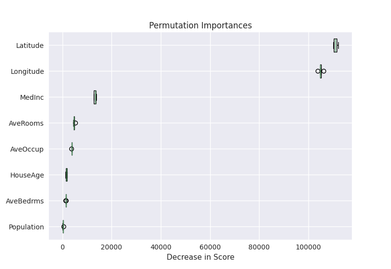
The model card class also provides a convenient method to add a plot that visualizes permutation importances. Let’s use it:
pi = permutation_importance(
    gb_final, df_test, y_test, scoring="neg_root_mean_squared_error", random_state=0
)
model_card.add_permutation_importances(
    pi, columns=df_test.columns, plot_file="permutation-importances.png", overwrite=True
)
Card(
  model=StackingRegressor(estimators=[('kn... random_state=0), passthrough=True),
  Model description=Gradient boosting regressor ...y learn from geospatial data.,
  Model description/Intended uses & limitations=This model is ...ration purposes,
  Model description/Training Procedure/Hyperparameters=TableSection(51x2),
  Model description/Training Procedure/Model Plot=<style>#sk-co...script></body>,
  Model description/Evaluation Results=TableSection(3x2),
  Model description/Dataset description=California Housing..., 33:291-297, 1997.,
  Model description/Dataset description/Data distribution=PlotSecti...aphic.png),
  Model Card Authors=Benjamin Bossan,
  Model Card Contact=benjamin@huggingface.co,
  Permutation Importances=PlotSection(permutation-importances.png),
)
For this particular model card, the predefined section
"Citation" is not required. Therefore, we delete it
using model_card.delete. Be careful: If there were subsections
inside this section, they would be deleted too.
model_card.delete("Citation")
Finally, we save the model card in the temporary directory as
README.md.
model_card.save(temp_dir / "README.md")
Now the model card is saved as a markdown file in the temporary directory, together with the gradient boosting model and the figures we added earlier.
Conclusion
Hopefully, this has been a useful exercise. We took a deep dive into the task of working with the California Housing dataset, gained a good understanding of the data, used some of the more advanced and less well known features of scikit-learn, and trained a machine learning model that performs well.
If you have any feedback or suggestions for improvement, feel free to reach out to the skops team, e.g. by visiting our discord channel.
Total running time of the script: (0 minutes 58.930 seconds)